Evaluation of college magazine
My
magazine uses conventions such as a masthead which contains the logo of the
magazine. This is placed at the top and is large in size so it can be easily
recognised and to make sure it stands out. My colour scheme had three colours,
purple, black and white. This is because these are the main colours of the
college that the magazine is about. My magazine has a footer which features a
Plug competition ‘Win free festival tickets’ this means that the person is more
likely to buy the magazine to enter the competition. It also features a barcode
which is conventional. The issue number and price is contained in the masthead
which is not always conventional of magazines. My magazine has a main image of
a college student which is a convention of magazines; my model is showing the mise-en-scene by carrying college folders
and having a smile on her face giving off the connotation that the college is a
great place to be. My magazine also has pull quotes which have captions which
summarise the articles, these are on the front cover so will attract potential
customers to buy the magazine. It also has a main story in bold which could
draw readers in to buy the magazine too.
My media
product represents teenagers in a positive light. The model is shown as happy
with college magazines and folders which have connotations of a hardworking,
sociable person. This means that the college is also seen in a more positive
way. The audience of my magazine is college students. This is shown by the
college student model on the front cover and the articles which are about
things which will interest people of that age group. The audience are attracted
in several ways. The social media logos of Facebook and Twitter mean that the
magazine is more accessible and relevant to teenagers who all have accounts on
these websites. This means that they are more likely to buy the magazine as it
is more connectable to them than if it had no social media presence. Another
reason why the audience may be attracted is the 'Win free festival tickets'
plug. This means that the target audience are more likely to buy the magazine
to have a chance to win tickets for the festival, this links to the pull quote
'New music reviews' which means that students who are interested in music will
probably buy the magazine to read about the latest bands. The price is also
affordable for the students; it is not as expensive as Vogue magazine which
costs a few pounds more. Its affordability means that students are more likely
to buy it. The main article 'Beat exam stress' will attract students to the
magazine as it will offer them advice for their exams so they are more likely
to purchase the magazine. Another pull quote ‘Interview with the principal’
will also increase the likelihood that they purchase the magazine as the students
will be interested to hear from the principal about issues that affect the
target audience.
During this task I
have increased my knowledge on Photoshop. I learnt how to draw and colour in
shapes which I have used for my masthead, footer and pull quotes. I also used
the text feature even more, with different fonts and colours which fitted into
my colour scheme. I also learnt more about camerawork and types of camera
angles and shots. I took several pictures for my magazine, several of which I
didn’t use on my front covers. The pictures were took in college as it was the
perfect setting and mise-en-scene for a college magazine. I took close-up shots
where the lens has been zoomed in to show just the face and perhaps the top of
the shoulders. I did not use these shots on the front of my magazine as it is
not conventional of magazine front covers. I took a medium close up shot that
shows the model and the setting behind them. I used this picture because it
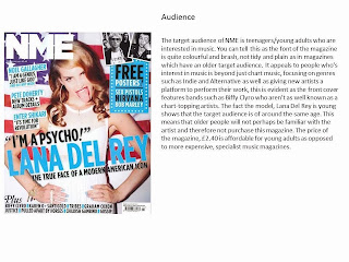
shows the college mise-en-scene and is conventional of magazines such as NME
and Vogue. I used long shots to take pictures of the college as these show the
whole subject in one picture, making it the preferred shot type for
backgrounds. I also took high angle shots; these are useful for showing the
whole body of the model and also the setting and background but from a
different angle. Low angle shots are also similar; these show the background
and model from the floor. High angle shots are conventionally used in magazine
photo-shoots.
I have learnt to take better pictures which show the
mise-en-scene and contain a model. For my perfume task I decided not to use a
model and instead use an original image of the sky to give connotations of
freedom and dreams however using a model means that it is easier to show iconographic
features of the place where the picture is set. I have also learned about how
to structure a magazine conventionally.
To improve my magazine front cover I would
design it more artistically because the rectangles look quite ‘blocky’ and make
the front cover seem to have too much on it. To do this I would put the pull
quotes on without a box displaying them and relate them to my picture


